Web Component 是浏览器的一个标准,通过该标准提供的 API,我们能够在 HTML 中我们能够将布局设计与代码逻辑结合,从而创造出一种全新元素,然后像使用原生元素一样使用它们。如果我们对一些重复使用的布局进行封装,那这就像在前端工程化中的所使用的组件一样。
Web Component
Web Component 十一个浏览器标准,它允许你创建可重用的预定制元素,并且将功能封装在布局代码之外,然后在 HTML 文档中使用它们。
Web Component 可以定义三部分内容
| 名称 | 别名 | 说明 |
|---|---|---|
| Custom element | 自定义元素 | 允许你定义 custom elements 及其行为,然后可以在你的用户界面中按照需要使用它们。 |
| Shadow DOM | 影子 DOM | 用于将封装的 影子DOM 树附加到预定义元素(与主文档 DOM 分开呈现)并控制其关联的功能。通过这种方式,可以保持元素的功能私有,这样就可以防止与文档的其他部分发生冲突。 |
| HTML template | HTML 模板 | <template> 和 <slot> 元素使你可以编写不在呈现页面中显示的标记模板。然后它们可以作为自定义元素结构的基础容器被多次重用。 |
Web Component 通常由类定义,包含有布局以及其关联代码,并且这个类需要继承 HTMLElement,然后通过 customElements.define() 方法加入文档。
注
此外如果使用 Shadow DOM,那么需要通过 this.attachShadow() 或 Element.attachShadow() 方法将 Shadow DOM 加入到布局中。
对于 <template> 和 <slot> 定义的布局模板,使用的预定义元素实例将共用同一个模板元素,因此在加入布局前,我们需要用通过 Element.cloneNode(true) 方法将模板的拷贝加入布局,防止因为操作原有模板造成的布局冲突。
优雅封装 Web Component 组件
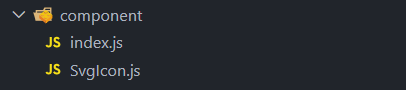
Web Component 需要通过 <script> 加载到主文档中才能进行使用,为了实现统一注册 Web Component 组件,我们可以利用 ESModule 的特性将组件载入。所以我们可以同时创建一个 component/CustomElement.js 和 component/index.js 文件。
然后在 componet/CustomElement.js 声明一个自定义元素类继承 HTMLElement,并且将其导出给外部使用。
class CustomElement extends HTMLElement {
    constructor() {
        super();
        ...
    }
}

export { CustomElement };
接着在 component/index.js 中将 CustomElement 注册到文档中
import { CustomElement } from "./CustomElement.js";

customElements.define("custom-element", CustomElement);
最后只需要将 component/index.js 通过 <script type="module"> 引入主文档,就能像在全局使用预定义组件了。
<!DOCTYPE html>
<html lang="en">
<head>
    <meta charset="UTF-8">
    <meta name="viewport" content="width=device-width, initial-scale=1.0">
    <title>Web Component</title>
    <script type="module" src="component/index.js"></script>
</head>
<body>
    <custome-element></custome-element>
</body>
</html>
封装 SVG 组件
SVG 自动加载组件的主要思路是通过文件名称加载 SVG 文件,通过请求得到 SVG 代码,然后嵌入到组件的 Shadow DOM 中。SVG 的代码将会被折叠在 Shadow DOM 中,从而不影响主文档的查阅。
为了实现 SVG 文件的自动载入,我们需要定义一个 SvgIcon 类,并且指定一个图片路径的前缀,用于拼接请求路径。
class SvgIcon extends HTMLElement {
    basePath = "/assets/img/svg";

    constructor() {
        super();
        ...
    }
}

export { SvgIcon };
接下来,我们需要在 SvgIcon 类中增加 SVG 的加载和渲染逻辑,我们将其分别定义在 loader() 和 render() 方法中。
| 方法 | 说明 |
|---|---|
| loader() | 异步方法,用于加载 SVG 图标。它首先获取 name 属性的值,这个值对应 SVG 文件的名称。然后构建 SVG 文件的路径,并使用 XMLHttpRequest 发起 GET 请求来获取 SVG 文件的内容 |
| render() | 负责将加载的 SVG 数据插入到组件中。它首先创建一个 template 元素,并将 SVG 数据设置为其内容 |
虽然我们指定本地获取 SVG 文件,但在浏览器中实际上是使用请求来完成的,因此为了保持兼容性,我们需要使用 XMLHttpRequest 来完成请求。
class SvgIcon extends HTMLElement {
    basePath = "/assets/img/svg";

    constructor() {
        super();
        this.loader();
    }

    async loader() {
        const svgName = this.getAttribute("name");

        const svgPath = `${this.basePath}/${svgName}.svg`;

        const xhr = new XMLHttpRequest();
        xhr.open("GET", svgPath, true);
        xhr.onload = () => {
            if (xhr.status !== 200) {
                return;
            }
            //xhr.responseText
        };
        xhr.send();
    }
}

export { SvgIcon };
最后,我们通过 this.render() 方法将 SVG 加入到组件中。并且我们可以兼容一些样式定义,例如 width、height 和 color 等,并将这些样式附加到 Shadow DOM 中的 SVG 上。
class SvgIcon extends HTMLElement {
    basePath = "/assets/img/svg";

    constructor() {
        super();
        this.loader();
    }

    async loader() {
        const svgName = this.getAttribute("name");

        const svgPath = `${this.basePath}/${svgName}.svg`;

        const xhr = new XMLHttpRequest();
        xhr.open("GET", svgPath, true);
        xhr.onload = () => {
            if (xhr.status !== 200) {
                return;
            }

            this.render(xhr.responseText);
        };
        xhr.send();
    }

    render(svgData) {
        const template = document.createElement("template");
        template.innerHTML = svgData;

        const width = this.getAttribute("width") || "100%";
        const height = this.getAttribute("height") || "100%";
        const color = this.getAttribute("color") || "currentColor";
        const style = this.getAttribute("style") ?? "";

        const svgElement = template.content.querySelector("svg");
        svgElement.setAttribute("style", style);
        Object.assign(svgElement.style, { width, height, color });

        this.attachShadow({ mode: "closed" }).appendChild(template.content.cloneNode(true));
    }
}

export { SvgIcon };
至此,我们完成了 SVG 组件的定义,只需要在主文档中引入即可使用。
<!DOCTYPE html>
<html lang="en">
<head>
<meta charset="UTF-8">
<meta name="viewport" content="width=device-width, initial-scale=1.0">
<title>Web Component</title>
<script type="module" src="component/index.js"></script>
</head>
<body>
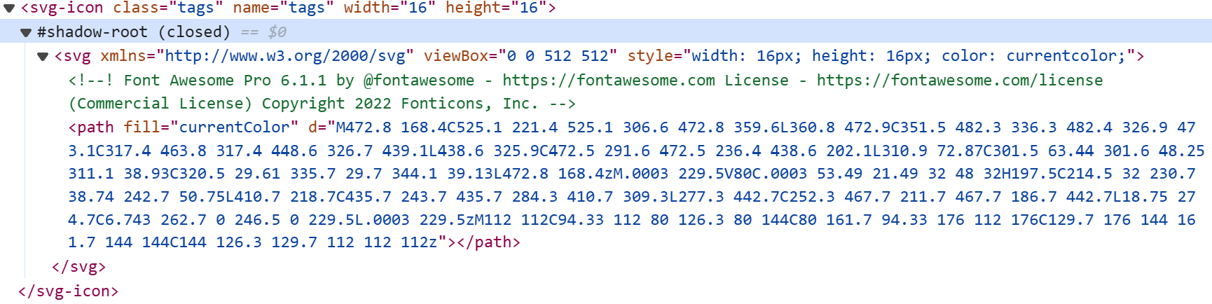
<svg-icon name="tags" width="16" height="16" color="#000000" style="margin: 5px;"></svg-icon>
...
</body>
</html>
界面显示效果
结语
通过使用 Web Component 封装 SVG 组件,我得以将博客中的 SVG 代码从代码中分离出来。也许这才是原生项目的新方向,比起熟悉的前端工程化编写方式,我还是更喜欢这种化繁为简的代码编写方式,因为这样并不需要考虑引入额外的库所带来的损耗。
总之,我推荐任何人都尝试一下这种原生特性带来的变革,一定会有不错的收获。